Container and Presentation Components in Angular2
Angular2 has a strong emphasis on components. An application is made up of a tree of components, starting from the root component and working down to child components. This helps to organize your application into logical and manageable pieces. Complex user interface can be broken down into smaller components, assembling them together, to better organize your application’s functionality and how it is presented to the user.
Components can be further categorized. Some components are just simple user interface components, for example like a date-picker widget or a simple user information card. These components are used throughout your application, but they don’t exercise your application logic. That work is delegated to other parts of the application. These components might be called “Presentation” (or “Dumb”) components.
Other components serve to organize and orchestrate the activities of child components and application services. These components know about the application logic. They might push application data down to child components and respond to events emitted by them. They might transform an event into a transition to a new application state. These components might be called “Container” (or “Smart”) components.
Example Application Components
Let’s look at how some of the components in the example application are organized. Of course, you might organize your components differently, but it at least gives us a base for discussion.
We’ll examine the components that go into one area of the application, the list of images.

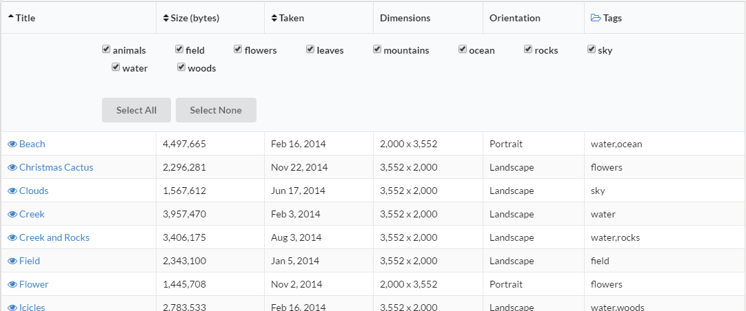
This component displays a simple table of all the images in the collection. Column headers are sortable, the row contains a link to view the image, and the expanding the “Tags” column header allows the user to select a subset of images to be displayed based on tags they have been assigned.
Now you could certainly implement all of this functionality as a single component. But you would find that the component becomes too “heavy”; it’s trying to do too many things. For the example, I broke down this functionality into the following components:
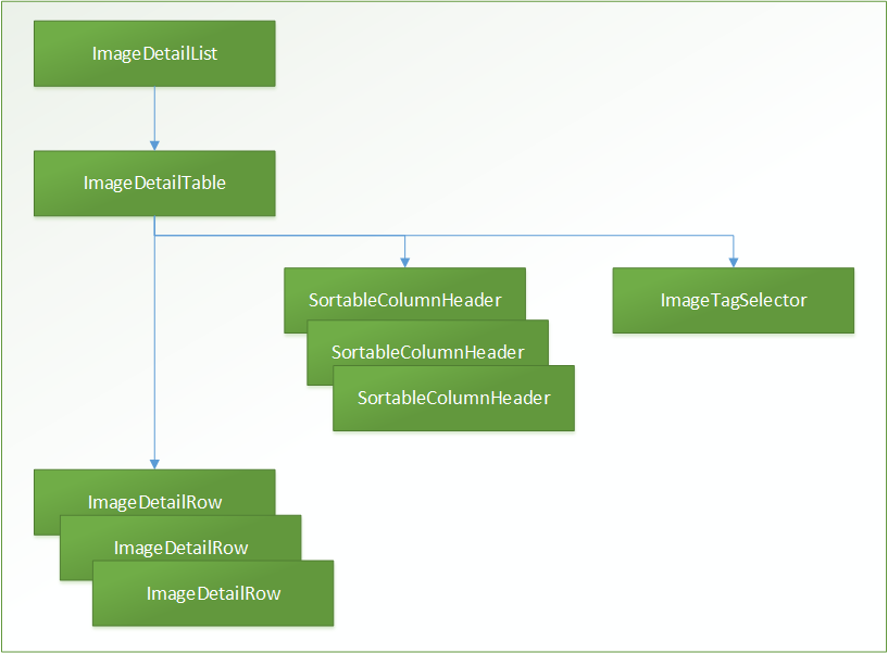
- ImageDetailList - the images list component (the main parent component).
- ImageDetailTable - the table itself.
- ImageDetailRow - a row within the table.
- SortableColumnHeader - a sortable table column header.
- ImageTagSelector - the image tag selector
I’ll get into the mechanics of using Redux to manage application state in future post, but of the components above, only two of them work directly with the application state. The ImageDetailList component needs the collection of images and the ImageTagSelector needs the collection of all tags associated with the images. The remaining components have data passed into them (through Input parameters) and tell the parent component that some event has happened (thought Output event emitters).
The components can be viewed as a hierarchy, a tree of components.

Let’s walk down the tree of components and dig into how they work together.
ImageDetailList - The Main Image Detail List Component
This is the main container component for displaying the list of images. Note that you shouldn’t think that only “widget” user interface controls and other presentation components can be reused within your application. This image list component can stand by itself and is reused within the the “Image List”, the “Image Groups”, and “Image Edit” views of the application.
This component is included within the application using HTML markup.
<image-detail-list></image-detail-list>Using this markup by itself, however, is not sufficient to instantiate the component and include it in the page rendering. Any component that includes this component needs to know about it. This is done using the directives property on the @Component annotation.
import {ImageDetailList} from '../../image-detail-list/image-detail-list'

@Component({
    directives: [ImageDetailList],
    ...
})
Adding the import and component class to the parent definition notifies Angular that the component will be included.
(This will probably be a very common issue that developers using Angular2 will encounter. “Why is my component not showing up?”, “Did you include it the component definition?”, “Arrghh!!”, Smacks forehead.)
This ImageDetailList component uses the ImageDetailTable component as a child component, which is declared using HTML markup.
<image-detail-table [tableData]="imageList" [sortBy]="sortBy" [isAscending]="isAscending" (toggleTitleSort)="sortByTitle()" (toggleSizeSort)="sortBySize()" (toggleDateSort)="sortByDate()"></image-detail-table>This may be like no HTML markup you’ve ever seen, but it is valid markup. The documentation for this template syntax will help to better understand this. Ultimately, however, what is going on here is that the child component, ImageDetailTable, exposes an API that the parent component, ImageDetailList, is using. It is binding its own data to API properties of the child component and responding with its own methods when events occur on the child component.
This is a great feature of Angular2. It makes the interface to your components much more explicit, and much easier to use.
Note also that the child component is a custom component that we’ve created. But this same API interface applies to regular HTML markup elements as well. Elements have properties and expose events and our Angular2 components work with them exactly as they do with custom components. In other words there is a very consistent interface for working with the elements within your web page, regardless what type they are, native element, custom components, or web components.
ImageDetailTable - Image List Table Component
So how does the API that ImageDetailTable exposes actually work? The component requires some inputs, specifically:
- the list of images
- how the images are currently sorted
- and whether they are sorted in ascending or descending order.
It also exposes some events, specifically, an event is emitted whenever the user chooses to sort by a particular column in the table.
So another way to think about this is that everything that the ImageDetailTable needs is passed to it through inputs, and everything that it does passes back out as outputs. It really knows about nothing else. This also makes it a presentation (or “dumb”) component.
The ImageDetailList component passes the data to the ImageDetailTable component through input bindings. It also registers a callback method for each of the emitted events through output bindings. These are defined in the component using:
@Input() public tableData: any;
@Input() public sortBy: ImageSortBy;
@Input() public isAscending: boolean;
@Output() public toggleTitleSort: EventEmitter<any> = new EventEmitter();
@Output() public toggleSizeSort: EventEmitter<any> = new EventEmitter();
@Output() public toggleDateSort: EventEmitter<any> = new EventEmitter();
These declare properties on the component class that can be used as bindings for a parent component. This also makes it clear what the component expects as input and what it emits as output, i.e., the component’s API.
The component can then use these properties just like other properties on the class. For example, the tableData property is used to render each row of the table.
<tbody>
  <tr class="image-detail-row" *ngFor="#rowData of tableData" [rowData]="rowData"></tr>
</tbody>
For events, let’s look at the column headers.
SortableColumnHeader - The Sortable Column Component
The SortableColumnHeader component is used in a column header to provide user interface for sorting the column in ascending or descending order. It’s a general component and really knows nothing about what it is sorting. It’s just a button along with an indicator that the column is being sorted.
The markup for this component uses the sort state to indicate what icon should be displayed. It also uses an ng-content element so that the additional content associated with column header can be displayed.
<div (click)="onHeaderClicked($event)" style="cursor: pointer;">
  <span *ngIf="sortIndicator < 0"><i class="fa fa-sort-desc"></i></span>
  <span *ngIf="sortIndicator > 0"><i class="fa fa-sort-asc"></i></span>
  <span *ngIf="sortIndicator === 0"><i class="fa fa-sort"></i></span>
  <ng-content></ng-content>
</div>
The markup also uses event binding to specify a method that should be called when the user clicks on the sort icon. (Note that the above technique is not very accessible-friendly.)
The component translates this click event into the specific event, toggleSort, that the component itself publishes.
@Output() public toggleSort: EventEmitter<any> = new EventEmitter();

public onHeaderClicked(event) {
    event.preventDefault();
    this.toggleSort.emit(null);
}
The ImageDetailTable specifies bindings to the SortableColumnHeader properties. It provides the current sort state of the column and binds the the toggleSort event for the column. In the example application three of the columns can be sorted.
<th class="sortable-column-header" [sortIndicator]="titleSortIndicator" (toggleSort)="sortByTitle()">Title</th>
<th class="sortable-column-header" [sortIndicator]="sizeSortIndicator" (toggleSort)="sortBySize()">Size (bytes)</th>
<th class="sortable-column-header" [sortIndicator]="dateSortIndicator" (toggleSort)="sortByDate()">Taken</th>
The ImageDetailTable then translates the toggle sort events into its own specific events.
@Output() public toggleTitleSort: EventEmitter<any> = new EventEmitter();
@Output() public toggleSizeSort: EventEmitter<any> = new EventEmitter();
@Output() public toggleDateSort: EventEmitter<any> = new EventEmitter();
These events ultimately get handled by the ImageDetailList component, the root component in the hierarchy of components. It knows more about the application state and what should actually happen when the user sorts a column. In this case it creates an action to submit to the Redux application store. (We’ll cover working with Redux and the application state in a future post.)
public sortByTitle() {
    this.appStore.dispatch(sortImages(ImageSortBy.title, this.sortAscending(ImageSortBy.title)))
}

public sortBySize() {
    this.appStore.dispatch(sortImages(ImageSortBy.size, this.sortAscending(ImageSortBy.size)))
}

public sortByDate() {
    this.appStore.dispatch(sortImages(ImageSortBy.date, this.sortAscending(ImageSortBy.date)))
}
So, the application responds to the user initiated event, selecting a column to sort by, by bubbling up the event through the component tree, transforming the event as necessary, and ultimately having the parent component do something with it.
ImageDetailRow - A Table Row with Image Details
The ImageDetailRow component handles generating a row of image details within the table. The table uses *ngFor to generate the table row (the <tr> element). In the markup below for using this component, #rowData specifies a variable that can be used elsewhere. We then use this variable to pass the image data into the rowData input property on the ImageDetailRow component.
<tbody>
  <tr class="image-detail-row" *ngFor="#rowData of tableData" [rowData]="rowData"></tr>
</tbody>
Markup in an table is a bit more constrained than other HTML markup, so we don’t want to use a custom HTML element for the detail row component. In this case we use a different selector, one that selects the image-detail-row CSS class. The template for the row then consists of the table data elements (<td>) within the row. It makes the assumption that the component would only be included within an HTML table row (a <tr> element).
@Component({
    selector: '.image-detail-row',
    directives: [RouterLink],
    template: `
        <td>
            <a [routerLink]="imageRouteFor(rowData)">
                <i class="fa fa-eye"></i> {{rowData.title}}
            </a>
        </td>
        <td>{{rowData.size | number}}</td>
        <td>{{rowData.dateTaken | date}}</td>
        <td>{{rowData.width | number}} x {{rowData.height | number}}</td>
        <td>{{rowData.portrait ? "Portrait" : ""}}{{rowData.landscape ? "Landscape" : ""}}</td>
        <td>{{rowData.tags}}</td>
    `
})
If you have experience with Angular1, then you’ll notice that the binding and filters that you used previously are still available in Angular2. However, filters have been enhanced and and now called pipes.
The [routerLink] property in the anchor tag above adds an application route, which we’ll also cover in a future post).
ImageTagSelector - Selecting Image Tags to Include
Finally, the ImageTagSelector component is used to select a subset of images to display based on tags that have been assigned to all of the images. This component deals with the application state directly rather than being a presentation component (though it certainly could have been implemented that way).
When thinking about how best to organize the components in your own application, there will always be trade-offs. Organize your components that make the best sense for the application and the team. I try to be pragmatic, since as developers we are trying to deliver business value.
This component subscribes to the application store and publishes actions to the store. Using Redux, however, tends to isolate your component and makes it easier to refactor later, if necessary.
A set of checkboxes is generated that includes the current list of tags associated with all of the images in the collection.
<label>
  <input #tagInput type="checkbox" [ngModel]="tag.isSelected" (ngModelChange)="toggleSelectedTag(tag.tag, tagInput.checked)" />
  {{tag.tag}}
</label>
When checkboxes are toggled, a new list of excluded tags is generated and an action is created for the application store to change the excluded tags state.
public toggleSelectedTag(tag, isSelected) {
    this.imageTags = this.imageTags.map(v => isMatchingTag(v.tag, tag) ? {tag, isSelected} : v)
    this.onSelectionChanged()
}

private onSelectionChanged(): void {
    let excludedTags = getExcludedTagsFromSelectedTagsList(this.imageTags);
    this.appStore.dispatch(excludeImageTags(excludedTags))
}
Hopefully this gives you a sense of how components can be used within an Angular2 application.